Student workshop logo results: The Sustainable Sweet Shop
Imagine being 16 again and you’re given a whole school day filled with creativity, discovery, and exploration of a career you want to learn more about. On Tuesday 11th of July, Amy arrived at a local secondary school, where 25 creatively-minded year ten students waited to start the creative challenge she would set as part of their careers day. Employers and business owners from across the county were invited to deliver a range of employer challenges to the students, catering to different students’ career goals and aspirations. For Bloom Creative’s group: branding and design.
Throughout the day, Amy guided her class through the branding process for not one, not two, but three ‘new’ local businesses. As the day unfolded, she led the 3 groups of students through a journey of understanding their customers and discovering the heart and passion behind the business concepts they were working on.
Each group's imagination took flight. The culmination of their hard work and creativity is a series of logos (and extra ideas!) that blew us away. They have designed bold logos that capture the heart of the businesses and appeal to their target customers.
In this blog post, we’ll reveal what one of the groups created. Get ready to be inspired and know that the future of logo design is in incredibly capable hands.
Each group was given an information pack filled with bios, ideas from their client’s customer persona sheets, questions to help them discover their business’ USP and more. The challenge was to create a logo, colour palette and set of fonts that pleased the client and suited the target audience.
Below you can read about the business team 1 was given: The Sustainable Sweet Shop and then you can see what they came up with! At the end of this post, we’ve brought their final idea to life digitally so you can see their vision in the most real way possible.
Team 1: The Sustainable Sweet Shop
The bio:
Tagline: Indulge Responsibly
Welcome to The Sustainable Sweet Shop, the place to be for awesome treats that not only taste incredible but also do good for the planet! We're all about satisfying your sweet tooth while being eco-concious. Based in the picturesque county of Kent, we're here to make your taste buds dance with delight in the most eco-friendly way possible.
We go the extra mile to pick out our ingredients with care, making sure they're organic and ethically sourced whenever we can. Our fantastic selection of treats, from chocolates to giant candy cables to lollipops and loads more, is all made using sustainable methods to help protect our environment.
We want to inspire our customers to enjoy their favourite treats while also looking after our planet. We use cool eco-friendly packaging, keep waste to a minimum, and get involved in our community to make a positive difference. We’re not just your average sweet shop! Join us on this super sweet adventure where you can have your treats and feel good about it too.
The customers:
Our awesome customers are a diverse bunch who share two things in common: they love yummy sweet treats and care about the environment. At The Sustainable Sweet Shop, you’ll find eco-conscious customers who are all about choosing sustainable and planet-friendly goodies for their own enjoyment.
Children and parents who want to enjoy sweets that suit their eco-friendly lifestyle are a big part of our sweet-loving community. We’re also a hit with teenagers and young adults who adore mouthwatering treats and want to support brands that care about sustainability.
Plus, we’re perfect for those who love giving thoughtful gifts too. If you’re someone who enjoys spreading happiness with unique, sustainable, and ethically made sweet treats, you’re in the right place. Come join us at The Sustainable Sweet Shop, where you can indulge in irresistible treats while doing good for our amazing planet!
The client’s initial ideas:
Nature-inspired
It could be cool to have something that combines elements from nature and our sweets (we sell a whole range of sweets - from lollipops, to giant cables, to chocolates, to pick and mix, to sweets in wrappers - so you have a lot of sweet icons you could use) to convey the eco-friendly and sustainable aspects of our business.
Minimalist
If you think it would appeal to our target customer, it would be nice to see an idea of something more minimal. Perhaps using negative space or bold typography to make an impact.
Client’s likes and dislikes:
We love colour - our sweet ranges are all very colourful! We like logos that are memorable, we want to stand out and stay in people’s minds. We’d like our logo to tell our story.
Team 1’s moodboard:

One of team 1’s ideas:

What the students said about this idea:
“We designed this logo idea as the green colouring shows eco and nature helping represent the sustainability within the brand. The elongated ‘S’ shows a swirl at the top representing a lolly/sweet and the bottom has a leaf: another representation of eco and nature. The pink represents sweet and fun things. The logo appeals to its target audience by appealing to the younger audience through the use of the bright and enticing colours. The green helps engage the older audience by using green showing healthy, sustainable and eco-friendly - the main USPs of the brand. Please note the green and pink will be more like the ones in our moodboard.”
Team 1’s second idea (chosen by client):
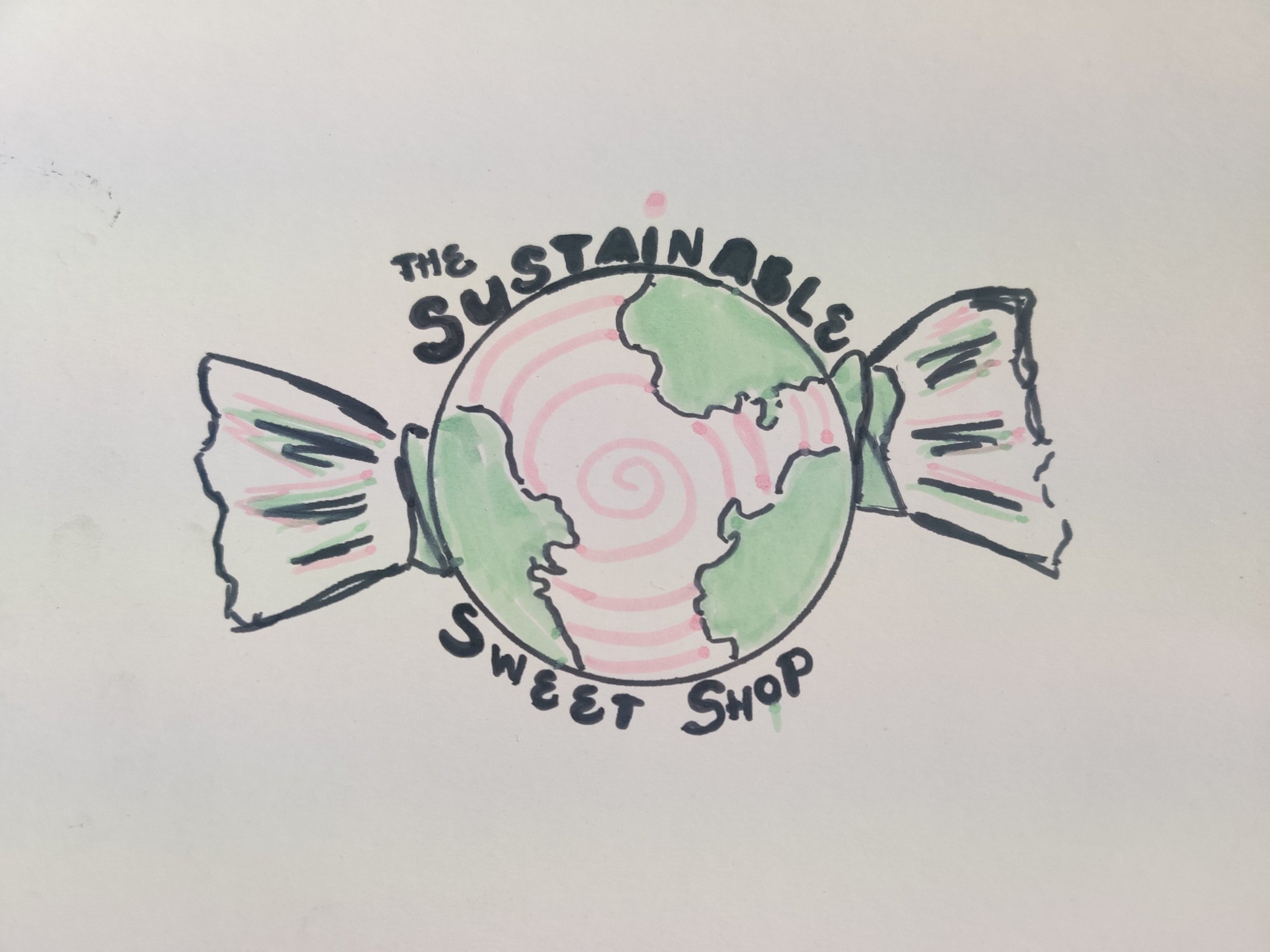
After testing a couple of concepts and getting feedback from the client, team 1 finalised the logo you can see above. They were keen to use the colours green and pink because they link to both nature/sustainability (green) and fun/playful/sweets (pink). Finding a common shape between the earth and a round sweet in a wrapper, they combined the two to depict a sweet that’s good for the planet. The logo also features the company’s biodegradable wrappers.
What the students said about their design:
“In our minimalistic design, we used a spherical shape that links to a wholesome feel, and the shape and image of the globe relates to the environmental aspects of the company. The bubble writing font helps attract the younger audience and has links to sweetness and childlike innocence. The font would also help grab the attention of the older audience, granting them with a nostalgic feel. The sweet wrapper is a clear symbolism of the sweet brand. The pink accents are colourful which help attract customers, and has connotations to creativity and fun, which are commonly associated with sweet shops, keeping that level of familiarity. The colour scheme of the logo can change depending on what sweet it is the packaging for. We’ve designed a custom font so that the brand is more unique.”
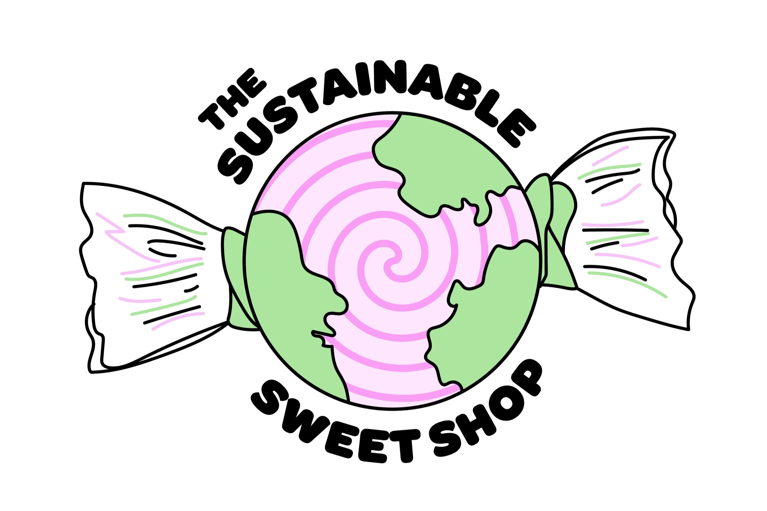
The final digital version
Taking their sketch, we’ve digitised team 1’s logo and brought it to life:
Extra ideas!
It doesn’t stop there. Once the logo was finalised, they spent some time brainstorming ideas for social media posts and sweet packaging. Take a look below at some of the ideas they came up with:
Packaging

Filters for social media

Collab with a sustainable jeans brand

The other teams
Check out what teams 2 and 3 created for their businesses: Aqua Adventure Golf and Skyview Safari Park.
Bloom Creative is a design business based in Kent offering branding & brand refreshes, quality digital design, and eye-catching print design. You can browse our services or book in a free discovery call.