Design tip #1 - when choosing fonts, less is more
Welcome to the start of our Design Tips series! There’s more to graphic design than ‘simply’ creating beautiful posters, flyers, logos, websites, and infographics. We’ve written these posts to help you enhance your designs. If you consider these tips when creating your designs, they will look and perform better!
Let’s talk fonts. Whether you’re designing a piece of content for socials, a flyer for a campaign, or choosing the main fonts for your brand, often “less is more”.
Less fonts in one design = more impact
There are no hard and fast rules about pairing fonts together, as long as you have a good reason for pairing them and it works in the project you are creating. That being said, there are some tips that can help you to pair fonts well.
It’s good practice to have no more than two fonts in one design, generally. An easy way to remember this is ‘2 in 1’ (like body wash & shampoo). When using different fonts, have no more than 2 in 1 design. Once you’ve chosen your main font, choose one other to pair it with.
Lots of designers have shared their favourite font pairings online and Canva has shared its own guide of 30 font pairings.
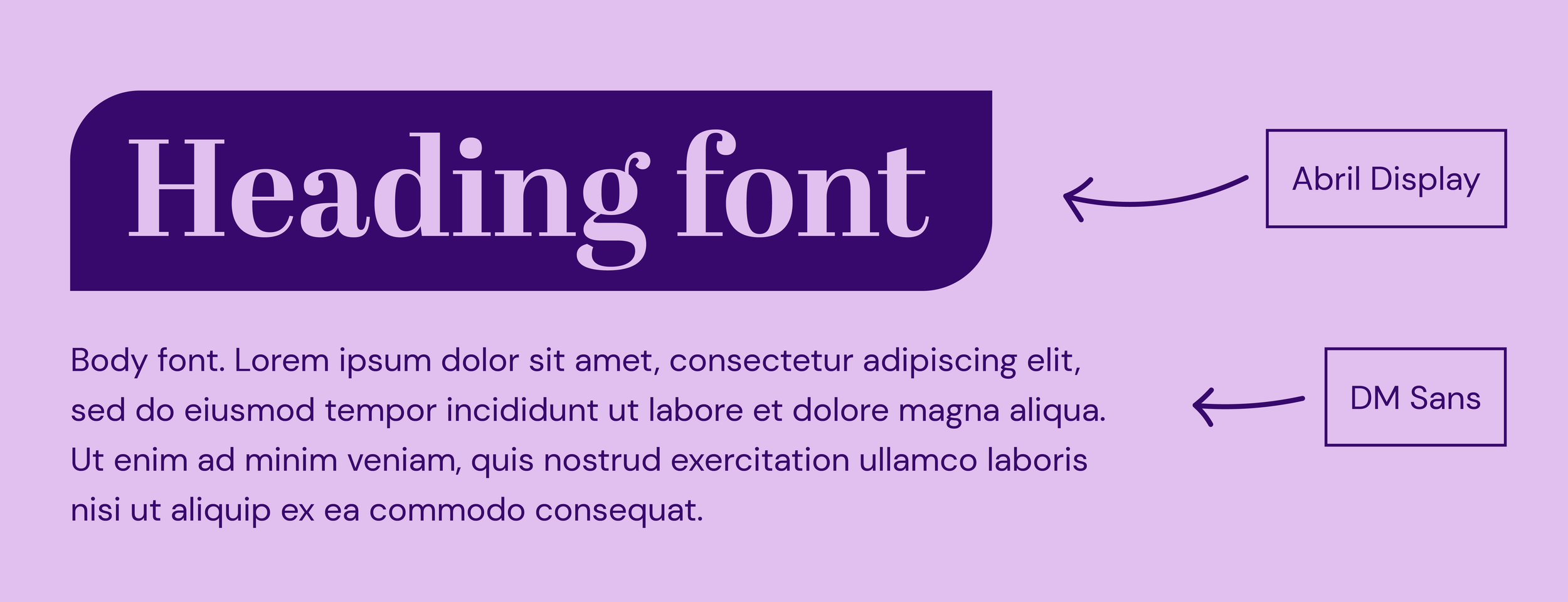
You could choose a bolder serif font and pair it with something simpler for smaller copy, such as:
Experiment with different font pairings, and have fun with it! It’s a creative process and it doesn’t have to be ‘perfect’. Pairing fonts is an art that takes practice.
As with any rule, there are of course exceptions. 3 or more fonts could work well in a magazine article with a heading font, a subheading font, and a body font.
The less “popular” the font, the more recognisable your business will be
There are now thousaaaands of fonts available online, which is great news for graphic design because the font you need is probably already out there somewhere.
But, whilst there are many fonts that are widely available, only a portion of them are free for personal AND commercial use. This means that those that are 100% free can become over-used.

Do you recognise these three fonts? It’s quite probable you’ve seen all three of them on more than one occasion, even if you haven’t noticed. The problem with free fonts becoming popular and subsequently over-used is that it can lead to a weaker brand identity for the businesses that use them as part of their visual identity.
That’s not to say you have to avoid all free fonts at all costs, but it is something to consider when you’re choosing your main brand fonts, especially your logo font. There are some affordable paid-for fonts that could be a great option for you.
The less ‘fussy’ the font, the easier it’ll be to read
Not all fonts are easy to read. Some fonts, including some of the more creative ‘arty’ and calligraphic fonts, are hard to read. It’s important to consider accessibility in your design and remember that some of your audience may be affected by visual impairment or a disability such as dyslexia. Further to this, there are some fonts that are harder to read for people without different needs too.
Here’s an exhibition banner we designed for See it, Be it CIC. We used clean fonts with a high level of contrast to be as accessible as possible whilst remaining on brand for them.

Accessibility in design is important for both your audience and your business. You want people to be able to read and understand your message so that you can reach everyone with the support or products your business offers. Plus it’s good practice to consider people with different needs so that they aren’t excluded! Scope have shared several font accessibility tips.
When you design your content, you know what’s been written, so you might not notice when a font is hard to read. Try revisiting it after some time to see if you can still easily read it, or ask someone you trust to check it over and give you honest feedback.
Top typography tips:
Check your main brand fonts aren’t so popular that they’re over-used
Try to have no more than 2 fonts in 1 design and experiment with different pairings
Choose your fonts wisely so that they can be read easily