Design tip #3 - make the important stuff stand out
There’s more to graphic design than ‘simply’ creating beautiful posters, flyers, logos, websites, and infographics. Our design tips series helps you to enhance your designs. If you consider these tips when creating your designs, they will look and perform better.
In this post, we’ll talk about how to create hierarchy in your designs - i.e. make the important stuff stand out. By using different font sizes, positioning, shapes, and colour, you can draw your audience through all of the information in your designs without overwhelming them.
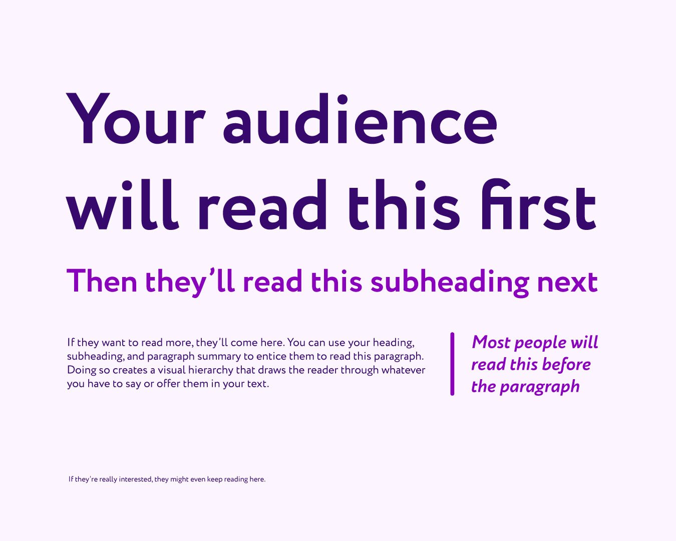
Take a look at this image:

Our eyes are naturally drawn to the big text in the middle with a different coloured background, then to the text below it that’s a little smaller, and again below there, before reading the text in the top left corner. It’s quite possible that you noticed all of the text when you saw the image. But instead of questioning where to look first, your eye was drawn through all of the information effortlessly.
How does it work?
We don’t like to think hard about how to consume information. Our brains like to take in the headlines first and decide whether or not to read the rest. If we like what we read, we’ll keep reading.
We’re drawn to the headline first - the bigger text that’s shouting ‘look at me’ - before any subheadings or paragraphs.
Traditionally, small print contains the information we need to know at the very end of what we’re reading. Therefore, our brains know to disregard the small print until it’s really necessary to read it (i.e. if we like everything else we’ve read and want to check out the terms and conditions). That’s why we won’t read the smaller text in the top left until last.
Here’s another example:
Our top tips for creating visual hierarchy:
1. Categorise your copy
Decide what your title or headline is, plus your subheading, any summaries, and calls to action. What do you want your reader to see first? What will entice them to keep reading?
2. Make your title or heading shout ‘look at me’
Use a pop of colour, a bold font, and/or a large text size to bring your headline or title to your reader’s attention. It doesn’t have to be at the top of the page, but that can help. You could get creative with a shape or colour behind the heading (just like the example at the start of this blog post).
3. Keep the rest simple
If you opted for large bold text for your heading, then choose something a little smaller and a bit less bold for your subheading. Same again for a paragraph summary. By the time you get to your paragraph text, it should look clean and simple. You’re aiming to use colour and font sizes to draw the reader through the information without overwhelming them, you’re not aiming to use as many colours and font sizes as possible (that’ll add to overwhelm).
4. Highlight your calls to action
Have you got a call to action you want them to take notice of? Try putting it in a circle (or other shape) and position it where they’ll see it at the right time. You want your reader to see your call to action after they’ve had some information to help make a decision, so you don’t necessarily want your call to action to be the biggest and first thing they see. But you do want them to take notice when they’re ready - it’s a creative balancing act.
5. Step away
When you’re up close looking at your design, it’s easy to lose sight of where the audience will be naturally drawn to first, second, etc. Take a break, step away, and come back to it after a few hours (or the next day). With fresh eyes, you’ll be able to see where your eyes are drawn. If you haven’t got time, you could ask a trusted friend or someone in your network to look over it with fresh eyes for you.
6. Get creative and experiment
Don’t be afraid to try new things out! Find inspiration and put your own spin to the visual hierarchy in your design. Once you find something that works, you can replicate it in other designs that you create.
Bloom Creative is a design business based in Kent who support local and national businesses with a range of services that enhance their brand and get them seen and remembered, including: quality digital content, eye-catching print design, and bespoke branding & brand refreshes.
If you’re interested in our services and/or getting to know us better, you can book in a virtual coffee break call with founder Amy Walters.