3 ‘Golden’ rules for your own rebrand
Earlier this week, Tate & Lyle (now owned by American Sugar Refining Inc.) revealed their new branding for Lyle’s Golden Syrup. If you haven’t seen the buzz yet, in short: the new lion icon has caused up‘roar’ amongst loyal customers and followers…
We’re going to delve into the controversy and the positives (which haven’t made it into the widely circulated media headlines) of the golden syrup rebrand and leave you with 3 ‘golden’ rules to bear in mind for your own rebrand!
What’s the new look for Lyle’s Golden Syrup?
Without further ado, here’s the before and after:

Images: Lyle’s Golden Syrup
Whilst most of their products are receiving the new update, their iconic tins will remain with the old branding (the same branding they’ve had for over 150 years!)
So, why the controversy?
It’s only natural for humans to be opposed to change, but the controversy here seemingly goes a little deeper. In large, it’s about the symbolism of the dead lion that’s surrounded by bees. The origin of this was a nod to the story in the Christian Bible where Samson killed a lion and later discovered that bees had taken over the carcass, having made honey inside. He said “Out of the eater came something to eat, and out of the strong came something sweet.”
This coupled with the fact that the logo hasn’t changed in 150 years, has lead to a mixed receipt of the new branding.
What do we think of the new logo?
Here’s where we are going to take a different stance to what you may have seen going somewhat viral and spreading through the media. We quite like the new branding! And here’s why…
A brand refresh is a great way to modernise your brand whilst keeping some of your current brand elements 1) for consistency and 2) if they already do a great job at telling the brand story.
In the new logo, the designers have kept the iconic outer shape, the golden and green colours, and the font all the same. They’ve refreshed the look of the lion and the bees, and played with the decorative design behind to suit the new style but with a nod to the old. To us, it’s a great balance between old and new!
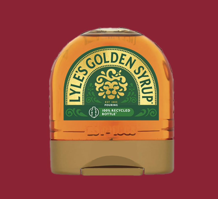
Image: Lyle’s Golden Syrup
The new golden syrup drizzle design
In this case, the branding is all about the product. This is because Tate & Lyle have a wider umbrella brand (which, interestingly, had a rebrand just a few weeks ago) and so the branding for their golden syrup products is specific to that line of products only.
Taking the opportunity, the designers have made the most of being able to show off the product itself within the logo. The lion icon is now made up of carefully positioned golden syrup drizzle and splashes - showing off the product that loyal customers know and love.

Image: Lyle’s Golden Syrup
The new hidden bees
Remember the Bible story that the old lion icon was based on? It wasn’t just about the lion, it was about the bees who made honey inside the lion’s carcass. This hasn’t been lost in the new logo… in fact, there are three hidden bees. Have you spotted them already?

New brand element for consistency
A quick visit to their website and you’ll see the designers have pulled out the splashes of syrup on the side of the lions face and used them throughout the website. We can see how this could be used throughout other designs too. Not only does it aid consistency (which helps to build trust and recognition with your audience) but the shape of the four splashes together is in keeping with the overall feel of the logo and brand: quality and somewhat regal.
Image: Lyle’s Golden Syrup
So, why the bad reaction and what can we learn from it?
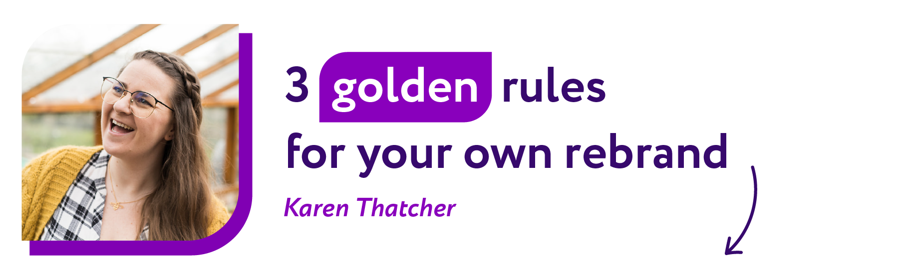
We know where the controversy stems from but could the company have done anything differently to communicate their new branding in a way that led to a more positive reception? We’ve asked comms expert Karen Thatcher from Thatch Creative in Kent to share her thoughts with 3 ‘Golden’ rules you can follow for communicating your own rebrand to your audiences.
Take the opportunity to frame and celebrate your rebrand (it’s a big milestone in your business after all)
Have your story ready to go in different formats before launch, tailored for your different audiences (social, web, press, email)
Invite your followers into the process before you make a big change. Test your logo out with your target audience first and ask their opinions!
You can read more from Karen at Thatch Creative about how to communicate your rebrand and her take on the comms around Lyle’s Golden Syrup’s new look.
Bloom Creative is a design business based in Kent who support local and national businesses with a range of services that enhance their brand and get them seen and remembered, including: quality digital content, eye-catching print design, and bespoke branding & brand refreshes.
If you’re interested in our services and/or getting to know us better, you can book in a virtual coffee break call with founder Amy Walters.